What's the gap between an AI-generated image and a presentation deck you can actually deliver?

What does an AI-powered PPT workflow in WPS look like?
What Does a WPS AIPPT Workflow Look Like?
👦🏻 Author: Jingshan
🥷 Editor: Koji
🧑🎨 Layout: NCon

For a while now, Nano Banana Pro has been almost a phenomenon.
What you've probably seen in your feed isn't tutorials, but page after page of forwarded PPT screenshots. Sophisticated color palettes, clean compositions, visual tension dialed up to eleven — these barely resemble the "template-style PPT" we all know.
The first time most people see them, a thought immediately springs to mind:
If only I could use this for my presentation next week.
But drop one into actual work, and some awkward problems surface. The most common, most practical one:
Can I edit the text in this image?
If you keep tweaking it with prompts, the words change — but the layout, white space, and graphic relationships get thrown off too.
This points to an increasingly obvious tension: as AI image generation gets seriously used as a productivity tool, whether generated images can be decomposed into layers and finely edited becomes the threshold itself.
It was against this backdrop that, about a week ago, while using WPS in our daily work, we noticed a new feature quietly launched in WPS AIPPT: "Image to PPT."
We stress-tested it for a week across real work scenarios — from various PPT-style images with different layouts to some more playful use cases.
🚥
What follows is our honest week-long experience, and how this feature performs across different scenarios, compiled into an article for you.
1) PPT
First, here's where to find WPS AIPPT's "Image to PPT" feature: aippt.wps.cn
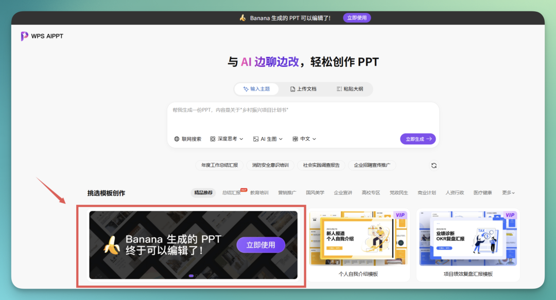
In my actual usage, WPS mini-program, web version, and desktop client all work fine — no real barrier to entry.
Let's start with layer analysis on two PPT reports. Honestly, based on my overall experience, PPT is actually the simplest and most straightforward use case for WPS AIPPT's "Image to PPT."
Why do I say that?
Let's start with a "consulting-style PPT" — a personal favorite.
There's been buzz lately about Elon Musk's SpaceX potentially pulling off the largest IPO in human history, so I used Nano Banana Pro to generate a SpaceX IPO strategic analysis report in consulting style.
Take these pages below. You'll notice something obvious: text colors across each page are split into 3 to 4 hierarchical levels. And it's not just body text — images contain embedded text elements too:
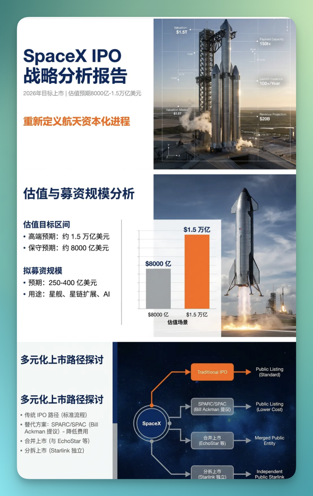
First, one thing needs to be clear: text in AI-generated images is not "editable text" in essence. More precisely, the model is "drawing" characters, not "typesetting" them.
So once you try converting this content into text that can actually be edited, selected, and copied in office software, font, letter spacing, line spacing, even glyph structure — almost certainly something will shift.
With that premise, let's look at WPS AIPPT's performance.
The first two images both converted to editable PPT fairly completely:
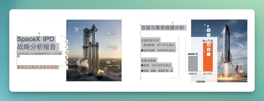
The third PPT, because it's a network-structured flowchart, yielded quite a lot of recognized content from WPS AIPPT — almost every piece of text could be individually identified.
After layer separation, I selected all recognized text boxes and added yellow borders.
This lets you very直观地 see: which elements it successfully split into independent layers.
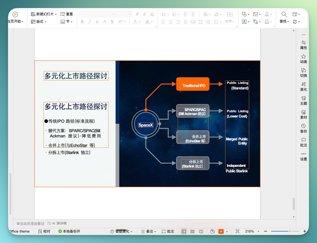
Next is a Claude-style PPT set, again focused on panoramic analysis of the SpaceX IPO — let's break it down in detail.
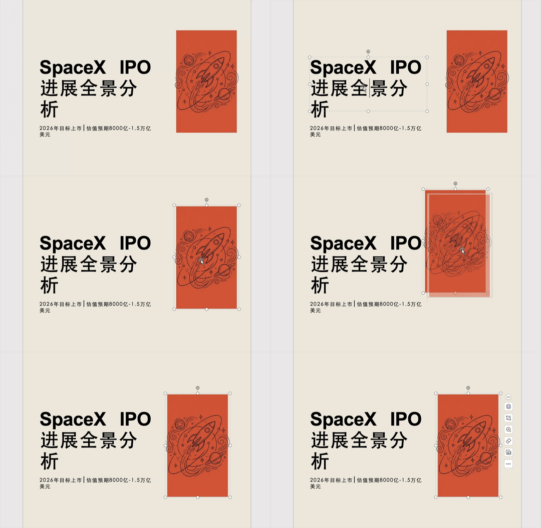
Starting with the first page. This is essentially a PPT cover. You can probably see clearly that it's composed of two parts.
The left side is a text area, cleanly divided into two different font sizes.
The right side is an orange-yellow icon element — very straightforward structure.

I recorded a GIF so you can see clearly: it's not just extracting text. It actually performs image-text separation on the picture, then recombines the text using two different font sizes of a sans-serif typeface.
Looking at the icon on the right, it's basically identical to the original.
And when I dragged it, I discovered a detail: it's already been split into a separate layer.
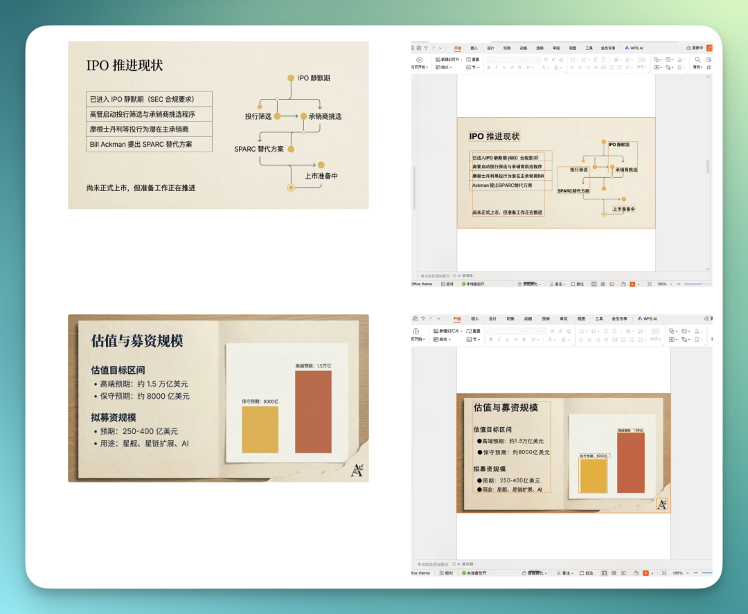
For these two PPT pages below, I marked all text boxes and icon boxes in the entire page with yellow borders.
This way, you can intuitively see: it deconstructed almost every element on the page, ultimately producing an editable PPT.
This image below deserves special mention. Why? Because it's an AI-generated image with built-in table structure.
At a glance, the core, heaviest element in the entire image is clearly that large central table.
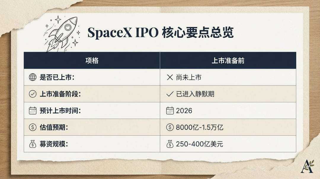
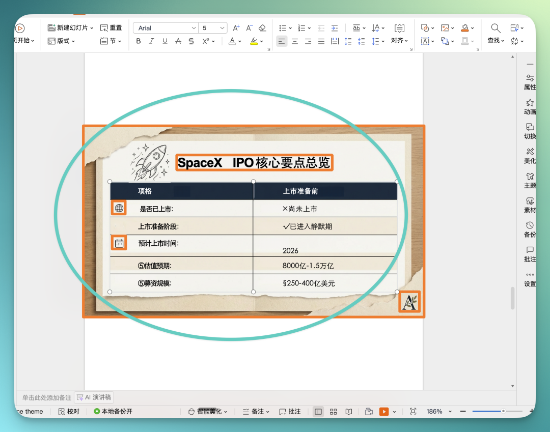
Below is the result after WPS AIPPT performed layer separation on that image.
While you can see that a few icons in cells on the left were missed, when I selected all, I found a crucial point: this entire central block wasn't deconstructed as ordinary text layout, but directly recognized as a "table."
This actually matters a lot.
In other words, when WPS AIPPT converts images to PPT, if it recognizes table structure, it tends to restore it as an actual table rather than splitting it into a pile of text for you to manually reassemble.
From a practical standpoint, this saves considerable effort.
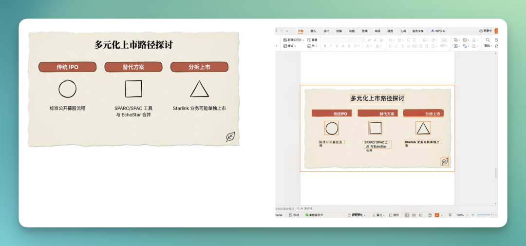
In this PPT below, the icons corresponding to the three paths can all be dragged individually. And visually, **they're nearly identical to the icons in the original image.
Overall, WPS AIPPT performs quite noticeably and consistently on layer separation for these kinds of standalone small icons.
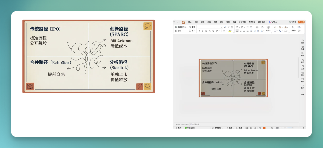
On this page below, the four line charts for traditional path, innovation path, merger path, and spin-off path are also implemented through table format.
The logic is: generate a table structure first, then fill in corresponding text and layout within the table according to the original image's composition.
Let's look at one final PPT.
On this page, you'll find quite high information density: many icons, many colors, background color blocks, numbered text structures. Text colors differ, icon types differ.
But in WPS AIPPT, almost all text has been successfully separated, and icons have basically been split into independent elements.
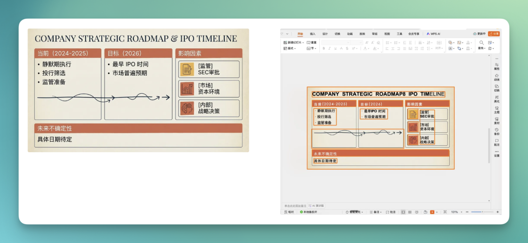
Even small icons like "regulation," "inspection," "internal" were individually recognized.
Fonts do still differ somewhat, but overall it's not a major issue, doesn't affect subsequent editing and use, and these separated text elements, beyond content changes, can also have font styles modified.
2) Science & Tech Academic Posters
That covers the overall conversion effects for PPT.
WPS AIPPT's core capability is converting images into editable PPT.
Beyond that, in my usage, I actually felt: using it only for PPT — this relatively simple scenario — somewhat underutilizes it.
The reason is simple: images in PPT usually have fairly clear structure, rarely featuring particularly complex, overlapping elements.
So later I "had some fun" and tested several atypical scenarios.
The one I found most interesting was science and tech academic posters.
Anyone who's attended academic conferences, especially in tech or research fields, knows this scenario: you need to create an academic poster with extremely high information density and very complex structure, then print it as a poster to display at forums or venues.
This use case, I personally feel, is actually quite practical.
So I first used Nano Banana Pro to generate an academic poster. Below is a high-density layout poster about VR glasses.
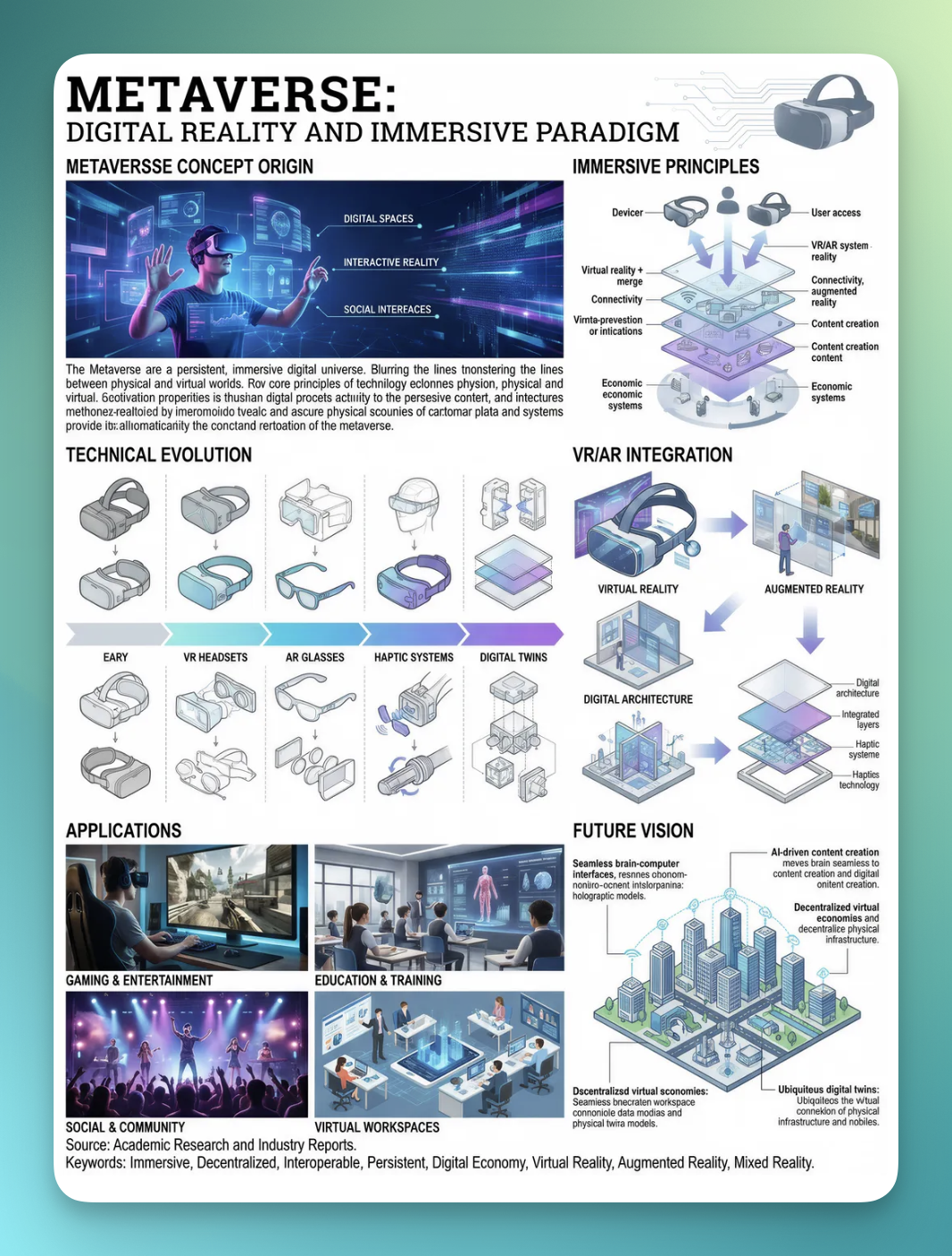
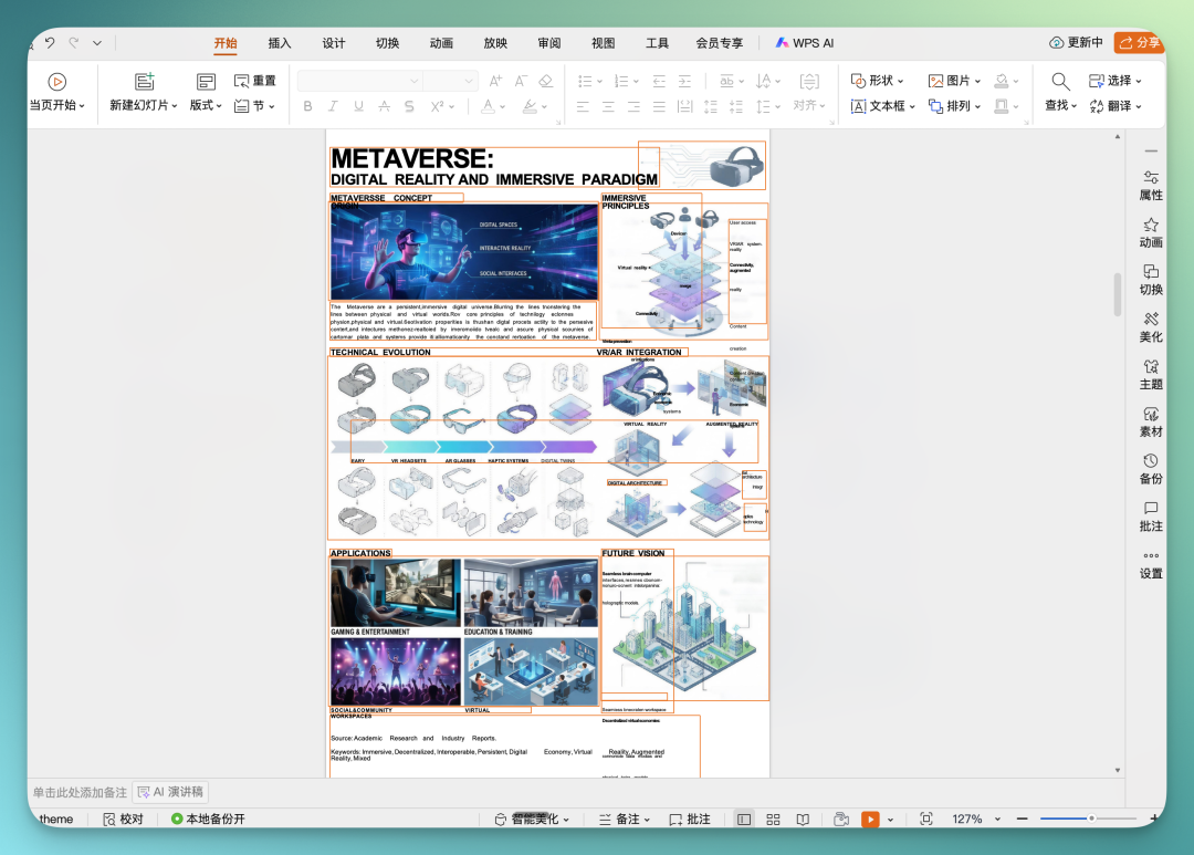
As usual, I directly selected all on this converted PPT. You'll notice something obvious: almost every element was successfully layer-separated.
And at a glance, you can see it has clear font size hierarchy design in this PPT page. From the poster's main title to the small descriptive text beneath images in the upper left, separation is generally quite thorough.
Text-image relationships are handled reasonably well too — no major hallucinations. Even minor issues here and there are all fixable and adjustable.
Take this section in the image below — I marked text portions in yellow, and the overall displayed effect is quite good:
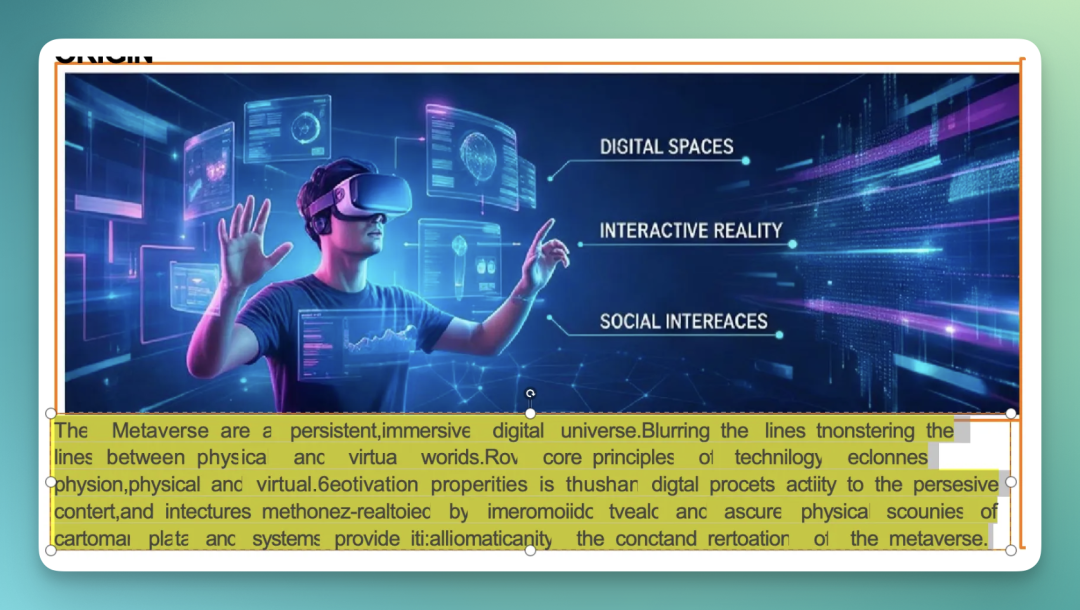
That said, with this kind of overall extremely high information density layout, it still inevitably produces some minor layout issues.
But my feeling is: these problems can be manually fixed. Where it should be separated, it's basically separated; icons and images are also separated quite thoroughly.
So for those slightly hallucinated or misaligned text portions, I just delete and retype myself — overall time cost isn't high, not a big deal.
3) Landmark Diagrams
Next, let's look at a particularly classic and common use case for Nano Banana Pro: generating an "explanatory diagram" for real-world landmarks.
I personally think this usage is quite nice.
Take this example below: the Eiffel Tower.
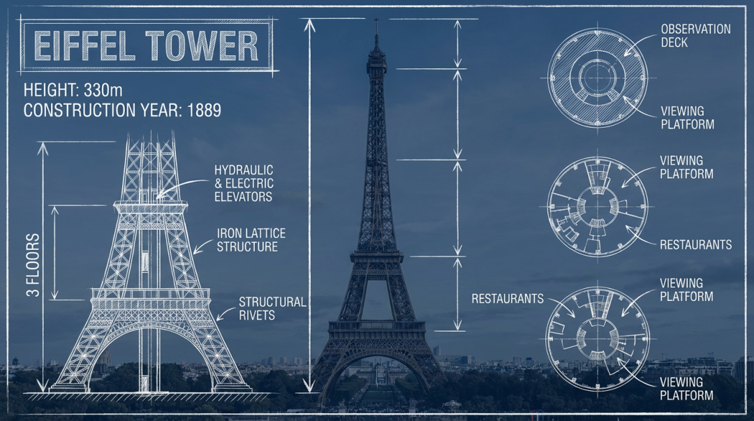
At this step, WPS AIPPT basically separated out all the elements and icons that needed separating, and the overall layout looks decent too.
Those 3 cross-section schematic diagrams of the Eiffel Tower on the right were all individually separated — directly draggable and independently adjustable.
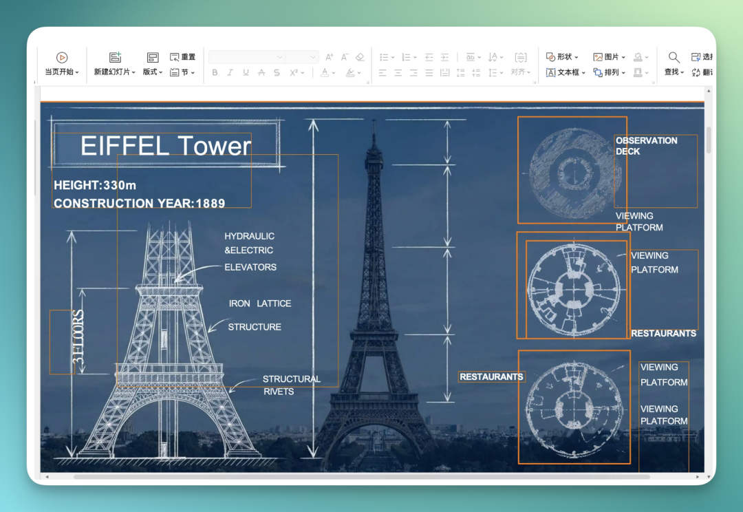
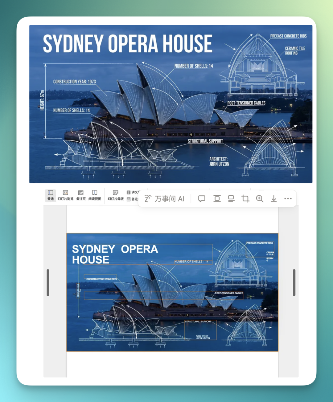
Same for the Sydney Opera House below:
4) Spicy Strip Explanatory Diagram
This next one is something I've seen many people playing with online lately: showcasing a specific object, then creating a very high information density breakdown diagram around its properties.
I tried it too. First used Nano Banana Pro to generate a spicy strip decomposition diagram, containing different usage scenarios, process flow, etc. — density is genuinely high.
Then I threw this image into WPS AIPPT to see if it could extract all these complex elements one by one.
The left image is the original decomposition I generated with Nano Banana Pro; the right is the result after WPS AIPPT's layer separation.
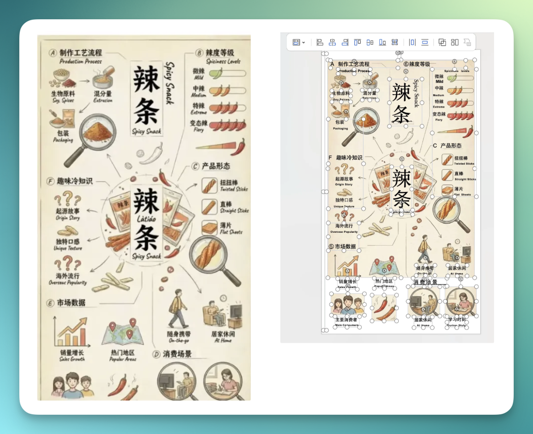
Overall, element separation is already quite accurate, but font portions may still need some minor manual tweaking.
However, you can already see that among these layers WPS AIPPT separated out, after I selected all text boxes and icons, overall precision is actually quite high.
Almost all text was successfully separated, with very few hallucinations.
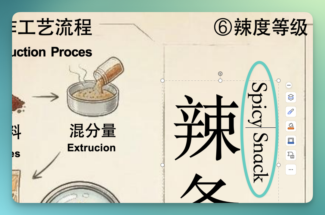
If you look closer, vertical English text like this — it actually automatically matches this layout format, rather than crudely smashing everything into horizontal text.
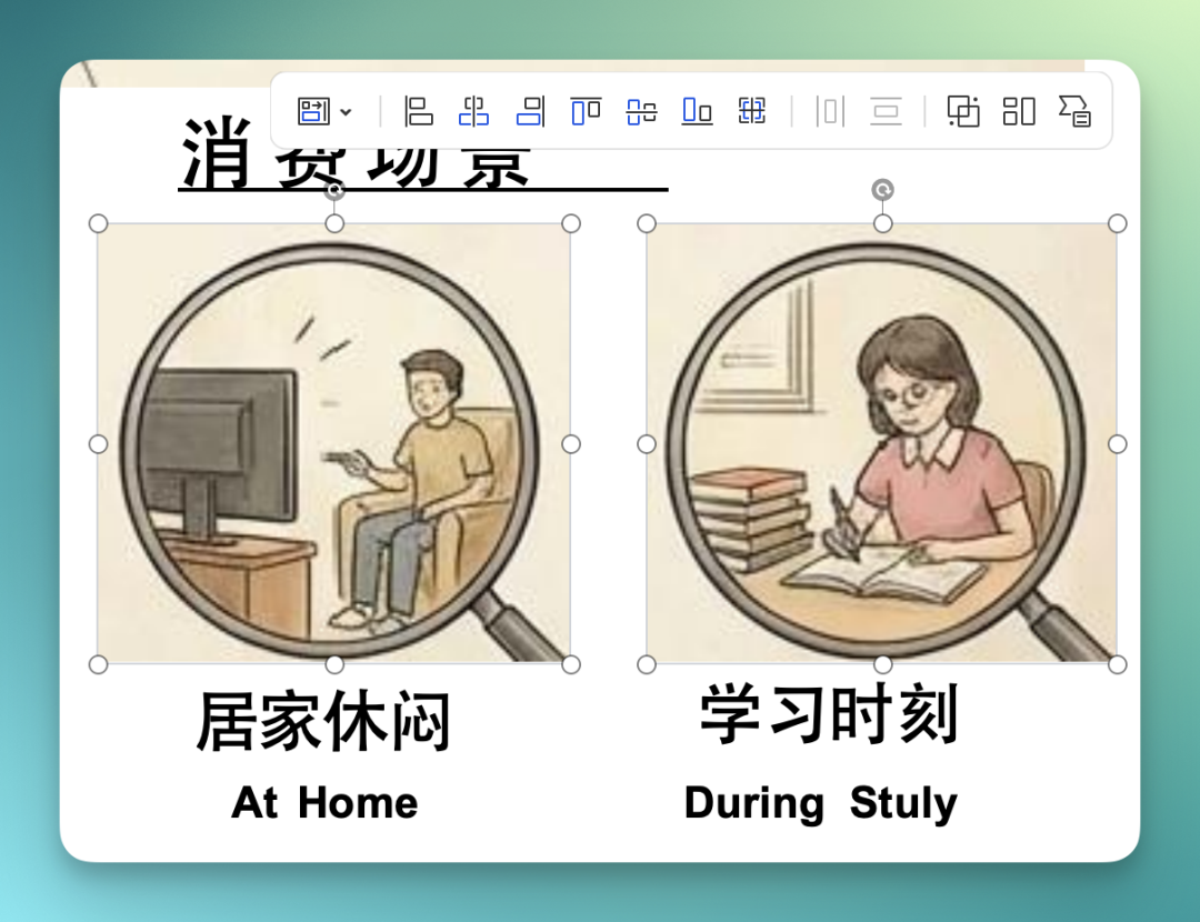
Then take these two individually extracted consumption scenario icons below — they've also been successfully layer-separated, directly draggable, deletable, or modifiable as needed.
5) Chiikawa Maximalist Diagram
This next image is a classic.
I saw this on Xiaohongshu from a creator @个案森林 (Case Forest) — a "Chiikawa Core System and Contributions Diagram."
It belongs to that extremely high information density layout — massive amounts of text and icons, very maximalist overall design style.
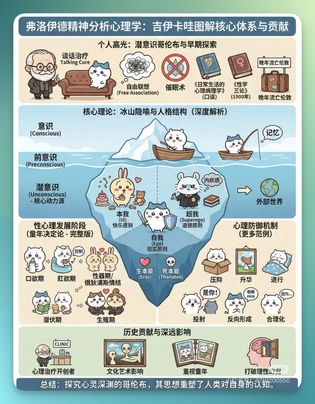
I later checked carefully and found that in this image, except for text embedded within icons, almost every character is directly editable.
And not just editable text — the background relationships from the original image behind the text are also handled quite cleanly, without that situation where changing text throws everything off.
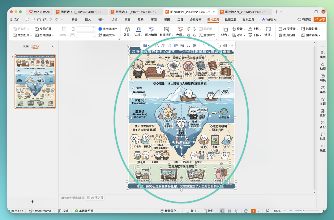
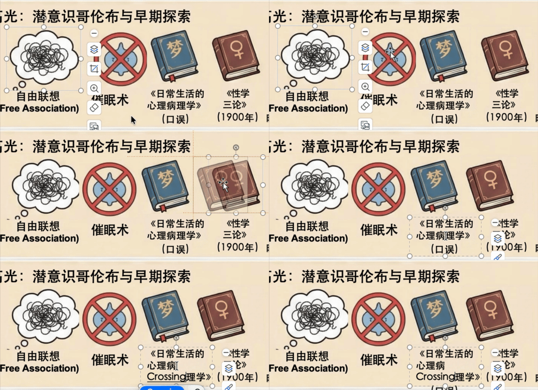
I also found that many icons have been separated:
WPS is fundamentally office infrastructure, serving people who need to deliver PPTs. And this makes it a very suitable, very scarce entry point.
Over this past year of AI tool development, a division of labor has vaguely emerged:
[1] AI generation tools solve "imagination";
[2] Office software solves "deliverability."
The problem is, for a while now, evolution in AI PPT has almost entirely happened in the former.
So when phenomenon-level AI models like Nano Banana Pro keep iterating, a typical problem emerges: people's creativity is overflowing, but execution is lacking.
Is there a way to preserve AI's aesthetics and creativity while returning to the controllability of office software?
It's from this question that a new AI PPT workflow gains meaning.
This is the entry point WPS wants to capture.
If you've also been repeatedly driven "bald" by the "looks great but unusable" problem with AI PPT-style images lately, you might want to try this direction and product.